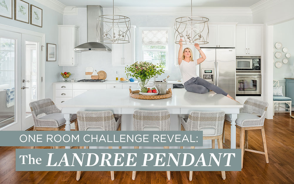
Written by Progress Lighting on July 9, 2020
Porch Daydreamer Tracey Amadio has what it takes to compete in the One Room Challenge™, a twice-yearly event, where twenty design influencers are challen

Porch Daydreamer Tracey Amadio has what it takes to compete in the One Room Challenge™, a twice-yearly event, where twenty design influencers are challenged to transform a room of their choice. Tracey started her influencer career by posting a few DIY YouTube tutorials that "went crazy," she said. She moved on from YouTube and now uses Instagram and her popular blog as platforms for her DIY tutorials, inspirational images and design projects. Tracey got involved with the One Room Challenge several years ago, at a time in her life when she was a single mom who had a "lot of time on her hands but not a lot of money," she said. For this year's spring competition, Tracey took on the challenge of a kitchen renovation, and we were happy to help.
 Changing out the existing kitchen pendants was a key element of her design plan. She turned to us at Progress Lighting to replace her
Cherish collection pendants, which, while perfect in her current kitchen, didn't meet the design aesthetic she was going for this time. "With this renovation, the main change I wanted to see was a space that feels more open. The original Cherish pendants with their large white pendant shades covered part of the view into the kitchen. And now that the cabinets are planned to be crisp white, the shades on Cherish were going to be too much white on white," explained Tracey. Tracey agonized for two months over her lighting choice, exploring different looks. "However, I love the French Country look and ultimately went back to "pretty," which is why the
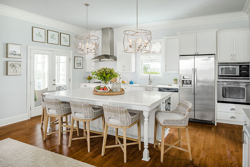
Landree pendants are perfect. Plus, they fit two of the major design trends for lighting this year with its silver leaf finish and its large, open design; and they look different than what I keep seeing on Instagram in kitchens," she said.
Landree's Silver Ridge finish perfectly fits the new backsplash tile that has a raised texture and a bit of silver and pearl shimmer.
"I always think of resale value when I renovate. For the backsplash, I wanted to mimic a large format tile that was subtle and not too polarizing. This tile has a shimmer, with a texture that is reminiscent of grasscloth wallpaper," said Tracey.
The exaggerated scale and elegant accents of its airy frame make the pair of Landree pendants the ideal choice over the kitchen island. Tracey advises: "Pay special attention to proportion. Over a workspace, hang the lighting at least 12 inches in so that it doesn't impede physical tasks - you don't want your lighting hitting you in the head as you work." The pendants also tied in beautifully with the subtle colors used for the cabinets and kitchen island. The island is a gray-blue, the cabinets are white, and for fun, Tracey painted the interior panel of the pantry doors a light gray to bring out the architectural details of the cabinets.
"Don't be afraid to do two-tone cabinets. It works when you keep the same value of color (the light to dark scale) using two different, understated colors. With my home being so open, the colors had to work with the entire downstairs. So, a gray-blue in the same value as the white was my best option!" We love the end result of Tracey's One Room Challenge entry, and you can get her look too! Shop the
Landree collection and more pendant lighting
here.
Photos by Tiffany Ringwald

